
Contrapuntal AI | R-Shief
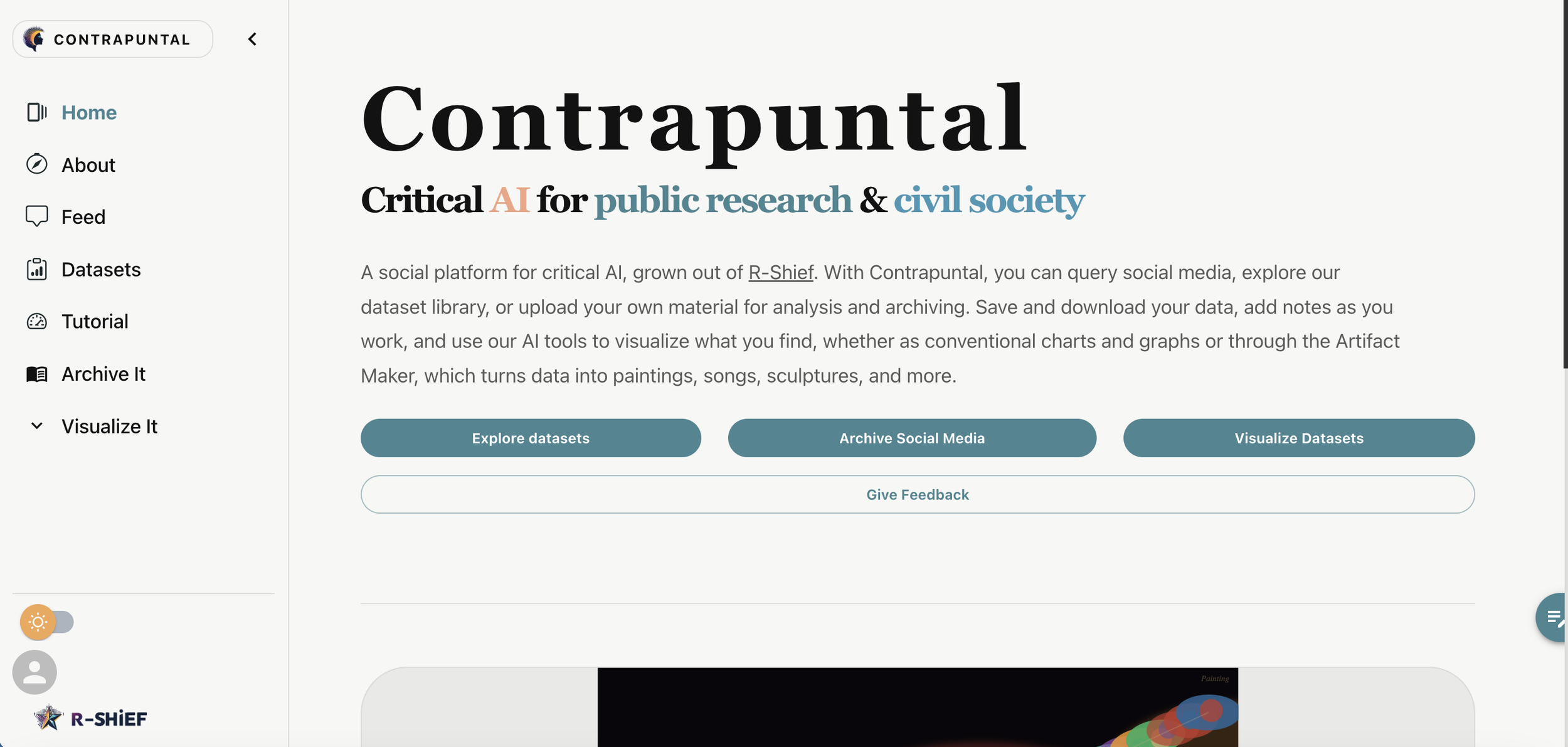
Sole UX/UI Designer · Wireframes, prototype and design system · Figma
Case Study
|
Product Design
|
Launched
|
Case Study | Product Design | Launched |
Overview
Contrapuntal is a human-centered AI platform for public research, built by the Creative Critical AI Undercommons at UC Santa Barbara alongside R-Shief, a 15-year social media archive. Where most AI tools hide their sources, Contrapuntal keeps every answer tied to its citations, so researchers can see where knowledge comes from.
I joined as the only designer on a cross-disciplinary team of faculty, graduate researchers and engineers, and owned the experience end to end: style guide, information architecture, every screen and the component library the developers built from.
Outcome
Launched publicly in September 2025, featured by UCSB's Division of Humanities and Fine Arts, and in grant conversations with Netflix and other companies to fund what comes next.
The challenge
The brief: transform R-Shief from a static informational site into a living, feed-driven platform, using X and Hugging Face as reference points, with Contrapuntal's AI built into the experience. The original scope was a style guide and seven pages. The real challenge was making dense research data feel as approachable as a social feed, for scholars and the public alike, without losing the depth researchers need.
-
Film and media, English, computer science and engineering each brought different priorities to one product.
-
Citations, datasets and concept relationships had to be readable at a glance and explorable in depth.
-
Core design had to land in about five weeks so engineering could build over the summer.
Designing from user stories
The team wrote scenarios for why a researcher would choose Contrapuntal over ChatGPT or Semantic Scholar. Two patterns kept surfacing, and nearly every scenario described thinking in webs of related ideas. Those insights became the backbone of the product.
Text-first researcher
Starts from a source and traces its connections
Led to dataset pages with labeled features and a path into related texts.
Question-first researcher
Starts from a theme and explores outward
Led to a prompt-first entry point and an interactive network graph that makes relationships clickable.
What I Designed
01
A prompt-first front door
A single input invites people to start with a question, not a menu. I designed the full flow from request to loading to response, plus a persistent assistant users can open from any page so the AI is always one click away.
02
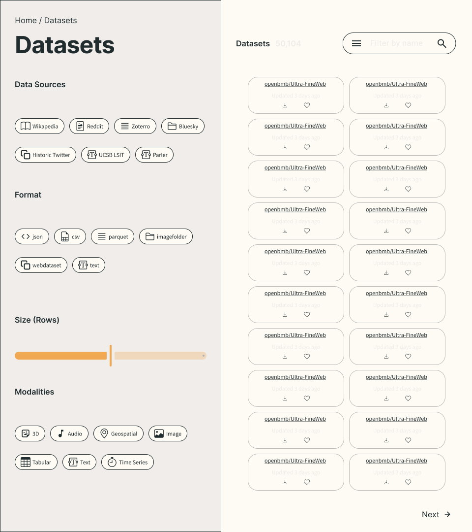
A dataset library built for discovery
Researchers filter by source, format, size and modality, open detail pages, and create their own datasets through a guided flow. My dataset dashboard design was the screen UCSB chose to feature in its launch coverage.
03
Making connections visible
The citations dashboard pairs an interactive network graph with citation cards and linked datasets, turning the team's "webs of ideas" into something people can see and click through.
04
A social layer and a system to scale it
A Data Stories feed, follow suggestions, trending datasets and profiles turned a static site into a community. Every screen ships in light and dark mode, built on a component library I designed on a Bootstrap foundation so it mapped directly to the engineers' code.
Weekly check-ins with the project lead, milestones in Notion and day-to-day collaboration in Slack. After handoff, I stayed on as the design point of contact while developers built page by page from my Figma prototype.
Process
May 2025
Kickoff
Presented style guide and mockup direction at the team retreat.
May to June
Design sprint
Landing pages, app flow, core pages, then final designs.
July to August
Build
Design support for a 5-person dev team.
November 2025
Recognition
Featured by UCSB, with grant talks underway
Results
In the press
UCSB's Division of Humanities and Fine Arts covered the launch, crediting me on the platform's Developers and AI Ethics team and featuring my dataset dashboard design. After launch, the project lead was interviewed by Netflix and other companies for grants to continue the work.
7 to 30+
Scope grew from seven briefed pages to 37 screens and flows
2 themes
Light and dark mode designed for every screen
Shipped
Built from my Figma and launched publicly in September 2025
What I took away
Designing for a team of scholars and engineers taught me to translate between very different priorities and turn them into one clear experience. Matching my components to the developers' framework from day one meant fewer handoff questions and a build that stayed true to the design. It's the same approach I bring to ecommerce: own the experience, and make it easy to ship.