

<
User Experience Design
>
< User Experience Design >
Interview Blueprint
Interviewing is tough, let's make it exciting and interactive!
Interviewing experience is something that sticks with candidates whether or not they are hired. Why not make it the best experience for the candidate to really show what your company has to offer? Prior to this project, candidates would receive a simple black and white email confirmation with the interview details. It was generic and didn't exemplify what working at Procore actually looks and feels like. We wanted to set ourselves above the industry norm and create a customized interview portal that not only would make the candidates feel excited to interview with our company while exemplifying our core values of Openness, Ownership and Optimism.
Goals
Demonstrate the Procore Employee Experience
Get rid of black and white onsite confirmations
Increase automation for Candidate Experience
Gather all interview resources for candidates to shift the focus on the interview itself
Procore's Customizable Candidate Interview Schedule and Portal
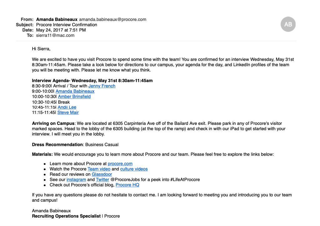

Example of interview confirmation (2017 and prior)
Collaboration
With the engineering interns as our "builders", we were able to:
Collaborate with Engineer interns on the look and feel of the website
Discover and organize information candidates research prior to onsite
Create integration with Greenhouse Recruiting software
Test
Interview Blueprint Current State
4,676 candidates received the Interview Blueprint since August 2017
Positive Feedback from Candidates
“The Portal Link is fantastic”- Luke G- APAC Account Executive candidate
“…the interview portal and guide are very cool and helpful!”- Dave S, UX Designer candidate
“The Agenda is very clear” - Chen L, Accounting and Finance Specialist Candidate
“I am already blown away by such an amazing, thoughtful and smooth interview experience so far. Can't wait to be there in-person!”- Bhavya S, Product Manager, Payments candidate
“The system you guys use makes things so easy :)” Kat H, Graphic Designer Candidate
Improvement Feedback from Candidates
“I parked by the building with the Nascar inside”- Clara S, Competitive Intelligence Manager candidate
“I didn’t click on the materials section because I had already received those links in my phone interview confirmation”- Ryan T, Install Base Account Executive candidate
“Based on 's LinkedIn profile, he still works at VMware in the bay area. Can you check if that's the right link?”- Shawn G, Senior Product Manager, Search candidate
“I had no idea where to park”- John C, IT Asset Management Intern Candidate
“I’m getting a little confused on travel. I’m getting pinged by an external company to arrange, plus this email, again today.” - Jacob S, Head of Revenue Operations, Enablement and Strategy candidate
Internal Feedback
Candidates had dietary restrictions/preferences we were not aware of and ordered lunch that didn’t suit their needs
Interviewers weren't always active updating their LinkedIn and coordinators would look the interviewers up on slack for the candidate before the interview
Interview prep wasn't included in Blueprint so coordinators would attach a PDF to interview confirmation
Travel wasn't included in the agenda and coordinators were getting emails from candidates out of confusion
What we learned from 1.0
-Candidates love the idea of an interview hub with all information in one place
-We created a necessary tool the talent acquisition industry had never developed
-We successfully started the Procore employee experience during the candidate process
-Although parking instructions were listed, candidates were still getting lost
-Candidates traveling in were getting confused with different itineraries for one interview
-The materials we were prepping candidates were outdated
-Candidates were not receiving current interviewers job titles
Goals for Version 2.0
-Organize using information hierarchy
-Different web and mobile experience
-Make website responsive
-Integrate with Workday
-Integrate with Pana
-Improve materials section with relevant information
-Interview prep is automatically pulled from department candidate is interviewing
“The biggest room in the world is the room for improvement.”
UI Design
Once I tested out all usability mistakes, I started designing the final screens in Sketch. I wanted a simplistic, fresh look which was inspired from Uber's mobile app. I designed for Web, Mobile and Tablet responsiveness.
My favorite page that I designed was the landing page because it integrates with Workday, which pulls the interviewers current job title and is much cleaner than the previous Blueprint. Looking at the homepage side by side, it is a vastly improved design that helps to achieve our goals because it shows the candidate the most important information:
When the interview is taking place
Where the location of the interview is
Who the candidate is interviewing with
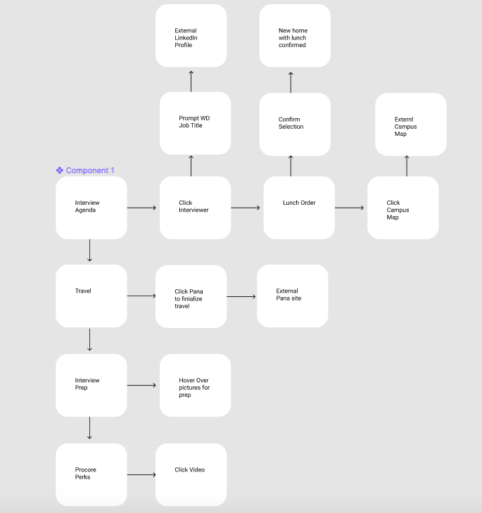
Interview Blueprint User Flow

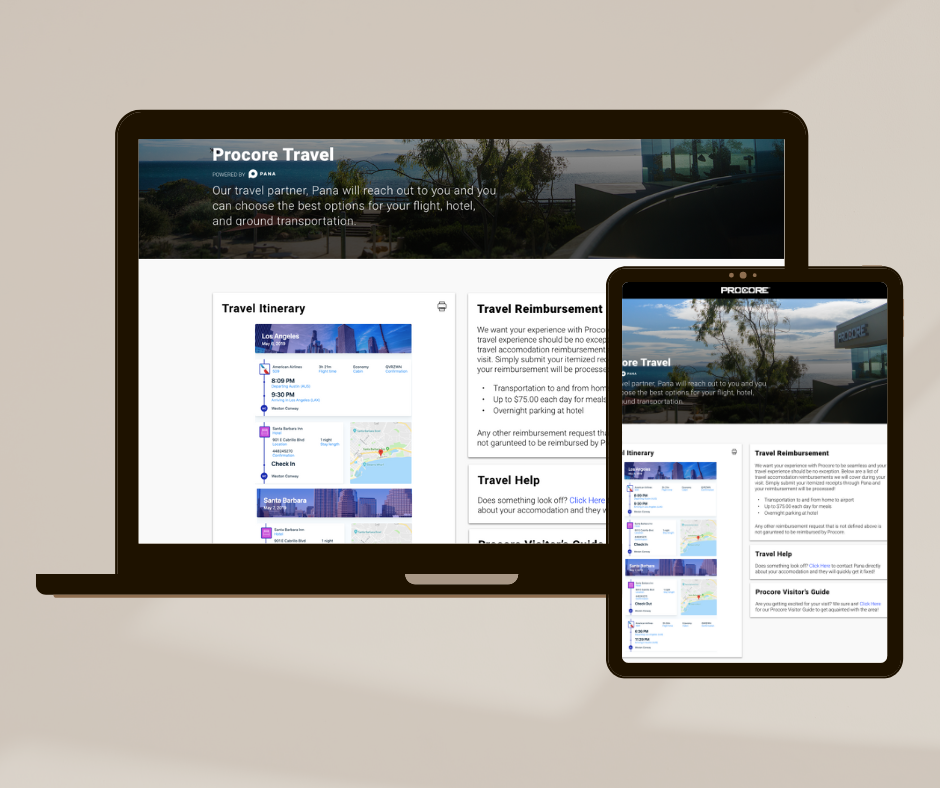
Blueprint 2.0 Landing Page
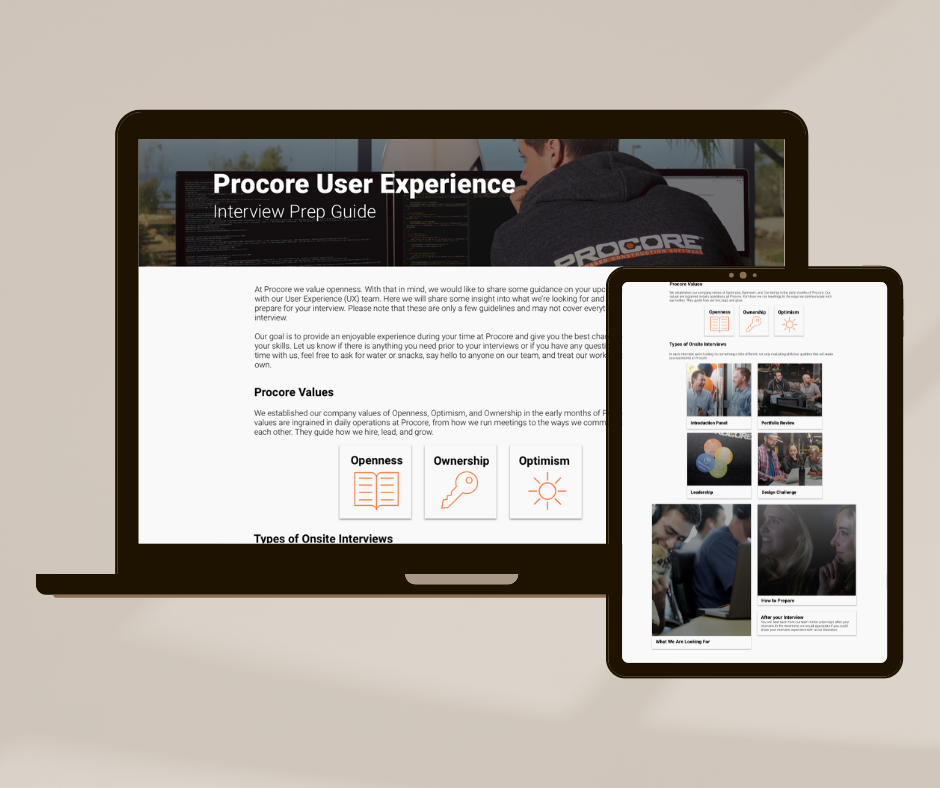
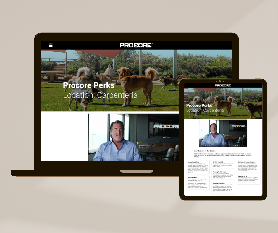
Virtual Onsite Interview Prototype
Due to the pandemic, a "Virtual Onsite" interview portal was created to emulate the experience candidates may experience typically at one of our offices. It was also of high importance to us that the candidates felt as comfortable as possible during a different interview experience. Click Here to access the prototype or check out a walkthrough below.
What have you learned from this project?
This project was my first time using Sketch and prototype in InVision. To say I learned a lot about how not to design is an understatement. I didn't know many shortcuts in the beginning on how to use the tools but improved significantly by the end. I am proud about how I always kept the users as my north star when making design decisions. My biggest takeaway was learning that a simple change in the UI of a website can make the product feel so much more sophisticated. The 2.0 solution was simple and solved the problems the users had experienced with a fresh, new user flow.
40 Versions of the 2.0 Blueprint
4 Integrations
196 Shots of Espresso
1 Great Interview Experience
40 Versions of the 2.0 Blueprint 4 Integrations 196 Shots of Espresso 1 Great Interview Experience
“This is amazing! It covers everything candidates search for when interviewing at a company
all in one place.”